元素
Elements help structure and present content effectively. They range from text-based components like titles, lists and text highlights to interactive ones such as buttons and links. Visual elements like images, icons, videos, and animations can also be added to improve content presentation and organization.
To add or modify a website element:
Navigate to the relevant website page and click on Edit.
Click the section on the page where you want to add or modify an element.
Make the necessary changes.
Click on Save.
注解
The default styles for headings, buttons, links, and paragraph text, for example, are defined in the Theme tab of the website editor.
Titles
Titles define headings and organize website content into different levels for clarity and structure.
To insert a title, type /title, choose the heading style (Heading 1,
Heading 2, or Heading 3), and type the text.
小技巧
Alternatively, type the text, select it, and choose the appropriate style from the Inline Text section in the Customize tab of the website editor. Additional formatting options, such as fonts and colors, are also available in this section.
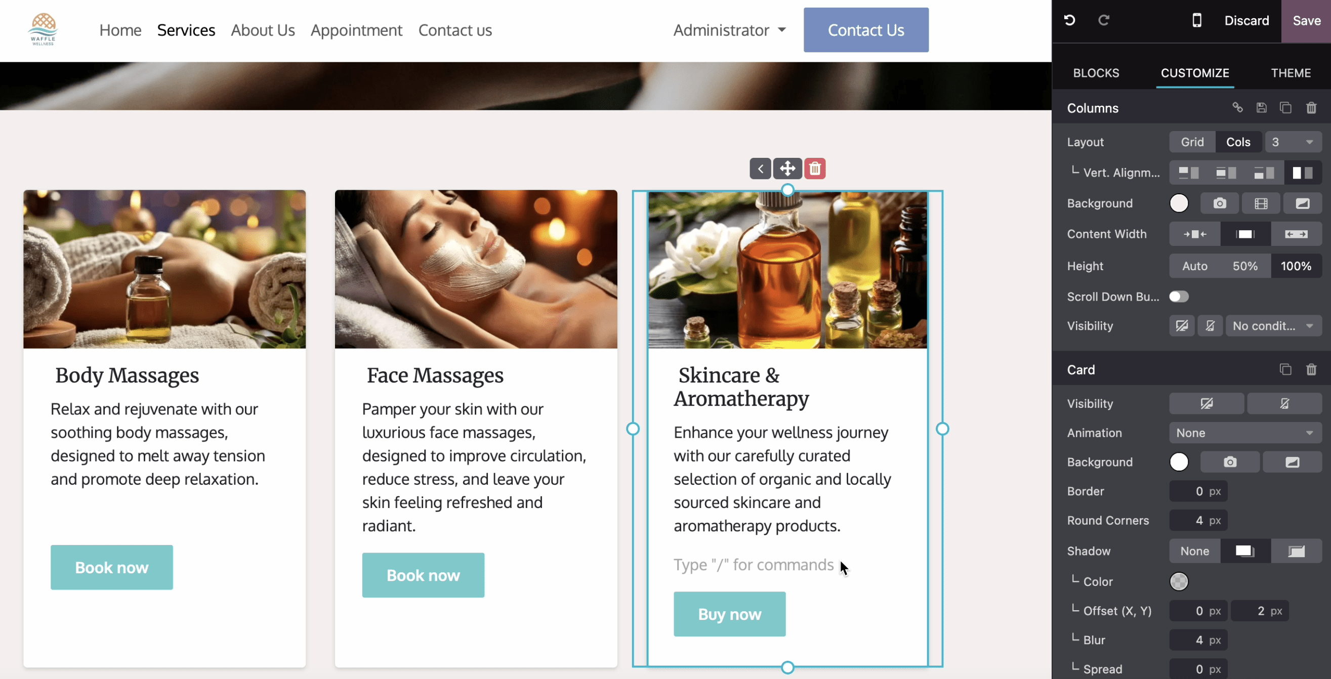
图像
To insert an image:
Type
/image.Search the Unsplash database or click Upload an image to choose a file from your local images.
Click Add.
To customize the image, click on the image and edit the options in the Image section of the website editor. For example:
Replace the image.
Define an alt tag in the Description field.
Enter a title tag in the Tooltip field. This text will appear when visitors hover their mouse over the image.
Add a Shape; some shapes also allow for color customization.
Adjust the image’s Width, e.g., to improve performance. A smaller size may be suggested if it is sufficient for display.
Resize the image using the Transform tool.
Adjust the Padding to add space (in pixels) around the image.
Etc.
视频
To add a video, type /video, insert the URL, and turn on the desired options:
Autoplay: to automatically play the video when the page is accessed. The video is automatically muted by default.
Loop: to play the video on a loop.
Hide player controls
Hide fullscreen button
图标
To insert an icon, type /image, go to the Icons tab, select an icon, and click
Add. To modify an icon, click on it and use the Icon section of the website
editor to customize options, such as Color, Size, Animations, Shape, etc.
链接
Links are used to connect different pages and resources, guiding visitors and improving navigation.
To add a link, type /link, then, in the pop-up that opens, enter the link’s Label and
add the URL or Email. Type / to search for a page and # to link to an anchor.
小技巧
By default, the Style field is set to Link. Select a different style to transform the link into a button.
列表
Lists help organize content clearly, making information easier to read and improving web pages’
structures. Type /list and choose from three different types of lists: Bulleted lists,
Numbered lists, or Checklists.
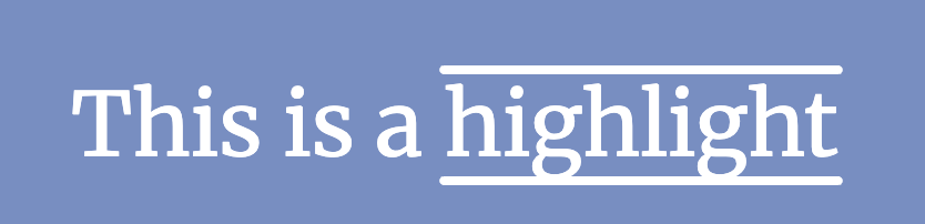
Text highlights
Highlights can be added to titles and text using in the Inline Text section of the website editor. To add a highlight:
Select the text or title you want to highlight.
In the website editor, click on Highlight.
Select the highlight style.
Modify its Color.
Choose its Thickness.
Animations
Animations are used to add movement to building blocks and website elements such as images and text. Three types of animation are available: On Scroll, On Appearance, and On Hover (for images only).
To add an animation to a website element:
Click on the element.
In the website editor, go to the relevant section for the element (e.g., Button, Column, Inline Text, etc.).
In the Animation field, select the desired animation type.
Customize the animation settings as needed. Available options vary based on the selected animation type.
Animations on scroll
For animations on scroll, it is possible to:
Choose In to add the animation when the element enters the screen and Out to add it when it leaves the screen.
Select an Effect.
Choose the Direction of the effect.
Adapt the Intensity of the effect.
Define the Scroll Zone, where the first value represents the percentage of the screen shown when the effect starts, and the second value represents its percentage at the end.
Animations on appearance
For animations on appearance, it is possible to:
Choose among different effects.
Choose the Direction of the effect.
Pick a Trigger option to define when the animation occurs: either the First Time only or Every Time.
Adapt the Intensity of the effect.
If you want the animation to be triggered after a number of seconds, define this number in the Start After field.
Choose a Duration for the animation.
Animations on hover (for images only)
Animations On hover can be added to images. You can choose the Effect of the animation, as well as the Color and the Stroke Width.
更多内容