General theme
Odoo offers various options to shape your website’s theme, including its colors, fonts, and layout.
When setting up your website for the first time, you are prompted to select a theme. Hover your mouse over the themes to see an extended preview of each one. Click on a theme to select it.
注解
If you leave without selecting a theme, your website is created using the default one.
You can switch themes later if needed.
In the website builder, the Theme tab offers various options to customize your website’s general theme. To access it, click Edit and go to the Theme tab.
Once you have made the desired changes, click on Save to confirm and apply them to your website.
Theme
In the Website section, click on Switch Theme to open the theme selector. Hover your mouse over the themes to see an extended preview of each one. Click on a theme to apply it to your website.
Colors
Odoo’s website editor features two main types of colors: theme colors and status colors.
Theme colors
Theme colors refer to the set of colors displayed across all pages of your website. These are made of five colors: three main colors and two light and dark colors.
To edit your website’s colors, go to the Colors section in the website editor, then:
Click on the color dot you want to change, then select a Solid color or click on Custom to pick a specific color tone manually (or add its #HEX or RGBA code).
Click on the paint palette icon and choose a color palette. As a result, all color customizations are reset; click a color dot to change a specific color.
Odoo automatically creates Color Presets for your chosen palette. These are predefined color combinations applied to different elements of your website to provide a structured and visually appealing design. When you select a color palette, its presets define how those colors are distributed across different elements from a building block, such as buttons, backgrounds, and text. If you want to modify them, click on Color Presets and click on a preset to customize it further. Each color preset contains colors for your building block’s background, text, headings, links, primary buttons, and secondary buttons.
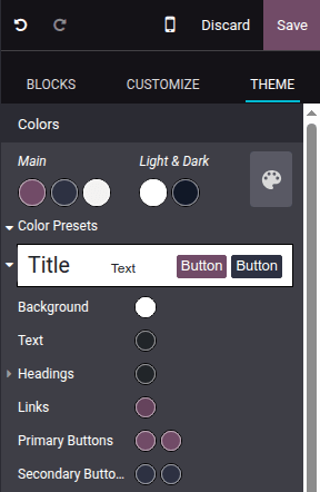
To apply a color preset to a building block on your site, select the building block, go to the Customize tab, click the color dot located next to Background, and choose a Theme.
注解
Changing a color preset automatically updates the colors of both the default preset and the building blocks where the preset is used.
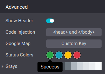
Status colors
Status colors are used to indicate the status of certain actions (e.g., Success, Warning, etc.). They’re used in pop-up messages that appear to provide feedback to users and website visitors. To customize your website’s Status Colors, scroll down to the Advanced section and click on the dots to change their color.
Example
Page layout
The Page layout option in the Website section allows you to change the overall display and spacing of building blocks and website elements on pages. Click the dropdown menu and select the desired layout. Under Page Layout, customize your Background by choosing an Image, using a selected image in a Pattern, or leaving it blank.
Fonts
Odoo allows you to customize the font family and size for specific elements on your website, including paragraphs, headings, buttons, and input fields.
Font Family: In the Paragraph, Headings, and Button sections, select a font from the dropdown menu.
Font Size: In the Paragraph, Headings, Button, and Input Fields sections, use the Font Size field to set a default size. Click the (arrow) icon to expand the section and define custom sizes (e.g., based on the heading level, button size, etc.).
Additionally, each element-specific section offers extra styling options, such as Line Height and Margins, for further customization.
Custom fonts
It is possible to use fonts on your website that are not offered by default in Odoo. To add a custom font, click the dropdown menu related to the Font Family field and select Add a Custom Font at the bottom of the dropdown menu. In the pop-up window:
To add a Google font, click on Select a Google Font and click on the desired font in the list. Toggle off the Serve font from Google servers if your website is operated from a location where regulations require compliance with laws such as, but not limited to, the European Union’s GDPR. This will ensure that the Google Font is stored on your website’s server instead of Google’s.
To upload a custom font from your computer, click on Choose File.
Once done, click on Save and Reload.
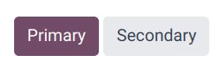
Button styles
To customize the style of your website’s primary and secondary buttons, navigate to the Button section in the website editor and edit the relevant options:
Click the arrow next to the Primary Style or Secondary Style fields and select one of the available styles for each type of button: Fill, Outline, or Flat. When selecting Outline, the Border Width option
Adjust the Padding to change the size of the spacing (in pixels) around the buttons’ labels.
Customize the buttons’ border radius using the Round Corners option.
Add an animation when a button is clicked in the On Click Effect dropdown menu.
小技巧
You can define custom Small and Large sizes for the buttons’ Padding, Font Size, and Round Corners: Click on the (arrow) icon and use the related fields.

Link style
In the Link section, click on Link Style to choose the appearance of links on your website. Select No Underline, Underline On Hover, or Always Underline in the dropdown menu.