订阅报告
The Odoo Subscriptions app provides a series of reporting pages to help companies analyze how subscriptions are performing.
On the Subscriptions Analysis reporting page, users can view specific data related to recurring subscriptions, quantity of subscriptions, in-progress or paused subscriptions, and more.
*留存率分析*报告页面提供了一个详尽表格,显示任意时间段内的订阅留存率。
The MRR Breakdown reporting page clearly divides MRR and ARR metrics for subscriptions into various graphs, lists, and charts.
And the MRR Analysis reporting page offers a time-based collection of analytics showcasing how subscription MRR and ARR have changed over the course of any given period of time.
Reporting page elements
All subscriptions-based reporting pages can be accessed via the Reporting header menu in the Subscriptions app.
The following sections describe elements found on each reporting page.
Filters and Group By
Filters are used to narrow down metrics to show specific analytics, whereas groupings (via the Group By option) are used to gather the data from specific sections into groups for more organized analysis.
This section refers to both filters and groupings, as a combination of the two can be saved in the Favorites section.
To modify the results being shown on any reporting page, click the (down arrow) icon to the right of the search bar. Doing so reveals a drop-down menu of detailed filter and grouping options.
If desired, a filter or grouping (or combination of filters and/or groupings) can be saved in the Favorites section of that drop-down menu. To do so, click the (down arrow) icon beside Save current search, located beneath the Favorites section.
This reveals a field to assign a title to the favorite filter. Two options are also found beneath the title field: Default filter and Shared.
Ticking the checkbox beside Default filter makes the newly-favorited filter the default option for that reporting page.
Ticking the checkbox beside Shared makes the newly-favorited filter available to other users in the database.
注解
The Default filter and Shared options are not required, and only one of these options can be selected at a time.
To save the filter, click Save in the Favorites section of the drop-down filter menu.
When clicked, that saved filter appears beneath the Favorites column of the drop-down filter menu, and a (gold star) icon appears beside the favorite filter’s name in the search bar.
查看
On the Subscription Analysis, MRR Breakdown, and MRR Analysis reporting pages, three different view options are located in the upper-right corner.
注解
There are no other view options available on the Retention Analysis reporting page.
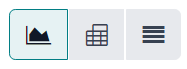
The available view options, from left to right, are:
Graph
List
Pivot
Each view has its own series of related view-specific visual options.
图形视图
选择图表视图后,搜索栏和数据可视化表示之间会出现以下选项。这些特定于图表的选项位于 计量方式 和 插入电子表格 按钮的右侧。
前三个选项(从左到右)代表不同的图表相关视图。其余选项表示组织和可视化特定图表相关数据的不同方法。
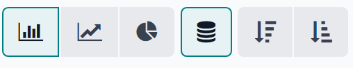
从左到右,与图表相关的具体视图选项为:
Bar Chart: showcases the data in a bar chart format.
Line Chart: showcases the data in a line chart format.
Pie Chart: showcases the data in a pie chart format.
每个图表视图选项都有自己的一系列特定可视化选项,这些选项由所选图表相关视图选项右侧的可用按钮表示。
When the Bar Chart graph view is selected, the following visual options are available:
Stacked: showcases the data in a stacked visual format.
Descending: showcases the data in descending order.
Ascending: showcases the data in ascending order.
选择 折线图 图形视图时,可使用以下可视化选项:
Stacked: showcases the data in a stacked visual format.
Cumulative: showcases the data in accumulated, increasing format.
Descending: showcases the data in descending order.
Ascending: showcases the data in ascending order.
选择 饼状图 图表视图时,没有其他可视化选项。
列表视图
With the list view selected, the subscription metrics being analyzed are displayed in a simple list, which can be fully customized by using any of the available filters or groupings in the drop-down filter menu (accessible via the (down arrow) icon to the right of the search bar).
注解
选择列表视图后,计量 下拉菜单和 插入电子表格 按钮**不**可用。
数据透视视图
选择数据透视后,订阅指标将显示在一个数据表中,该表可以完全自定义。
The pivot data table can be customized using the options available in the Measures drop-down menu, and/or the filter grouping options available in the filter drop-down menu (accessible via the (down arrow) icon to the right of the search bar).
Three pivot-specific options are available, located to the right of the Measures drop-down menu and Insert in Spreadsheet button.
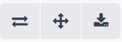
从左到右,这些与数据透视图相关的视图选项是:
Flip axis: the
xandyaxis of the pivot data table flip.Expand all: all the available rows and columns of the pivot data table expand fully.
Download .xlsx: the pivot data table is downloaded as an
.xlsxfile.
计量值
The graph and pivot reporting pages have their own metric-specific Measures drop-down menu of data-related options to choose from, located in the upper-left corner, above the visual representation of metrics.
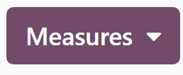
When the Measures button is clicked, a series of selectable measures becomes available, via a drop-down menu. When any of the options are selected from the Measures drop-down menu, the chosen metrics related to that specific measure appear on the reporting page.
注解
有关每个报告页面可使用的不同措施的更多信息,请参阅本文档下面的 具体报告页面细分 。
插入电子表格
Beside the Measures drop-down menu, there is an Insert in Spreadsheet button.
When clicked, the ability to add the configured data currently being showcased on the reporting page into a new or pre-existing spreadsheet or dashboard becomes available, via a pop-up window.
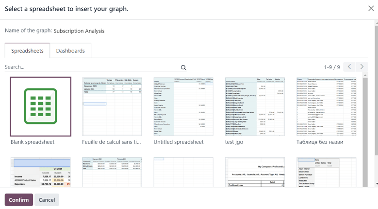
Select the desired option from this pop-up window, then click Confirm.
Reporting pages
In the Odoo Subscriptions app, there are four different reporting pages available.
To access, analyze, and customize various reports related to subscriptions, navigate to , and click the Reporting drop-down menu in the header to reveal the following reporting pages:
Subscriptions
Retention
MRR Breakdown
MRR Timeline
Clicking any of those options reveals a separate, fully-customizable reporting page focusing on that particular aspect of subscription data.
The following is a breakdown of those four specific reporting pages.
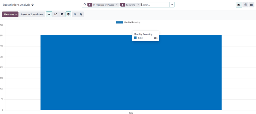
Subscriptions analysis
To access the Subscriptions Analysis reporting page, navigate to .
By default, the Bar Chart option, in the Graph view, is selected on the Subscriptions Analysis reporting page.
The following filters are also present in the search bar: In Progress or Paused and Recurring.
When the Measures button on the Subscriptions Analysis page is clicked, a series of metric-related options becomes available as a drop-down menu.
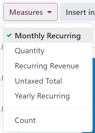
The metric-related options in the Measures drop-down menu on the Subscriptions Analysis page are:
Monthly Recurring
数量
Recurring Revenue
Untaxed Total
Yearly Recurring
计数
注解
The Monthly Recurring measure option is selected by default.
When any of those available measures are clicked, Odoo displays that selected data on the reporting page for further analysis.
Retention analysis
To access the Retention Analysis reporting page, navigate to .
The Retention Analysis reporting page differs from the other Subscriptions app reporting pages, in that it does not provide any additional view options. The data on this page is only presented in a customizable data chart.
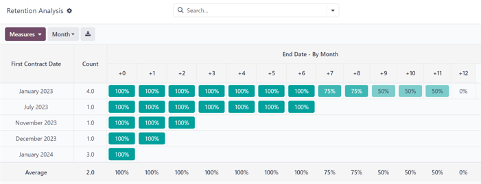
When the Measures drop-down menu on the Retention Analysis reporting page is clicked, a series of metric-related options become available.
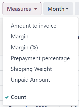
The metric-related options in the Measures drop-down menu on the Retention Analysis reporting page are:
Amount to invoice
Margin
Margin (%)
Prepayment percentage
Shipping Weight
Unpaid Amount
计数
注解
The Count measure option is selected by default.
To the right of the Measures drop-down menu on the Retention Analysis page is an additional drop-down menu containing different time periods. The default time period is Month.
When clicked, a drop-down menu of various time period options become available.
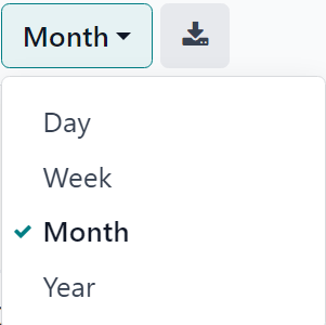
The time period options are:
Day
Week
Month
Year
When a time period option from this drop-down menu is selected, the Retention Analysis reporting page showcases data for the configured measures and filters within that time period.
To the right of the time period drop-down menu, there is a download button, which allows the user to download the data presented on the Retention Analysis page as an Excel file.
MRR breakdown
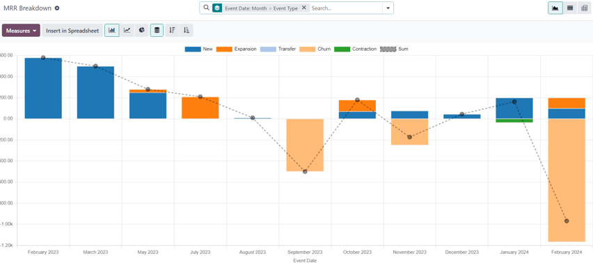
To access the MRR Breakdown reporting page, navigate to .
By default, the data displayed on the MRR Breakdown reporting page is in graph view, with the Bar Chart option and Stacked option selected.
A default filter is also available in the search bar for Event Date: Month > Event Type.
When the Measures drop-down menu on the MRR Breakdown reporting page is clicked, a series of metric-related options become available.
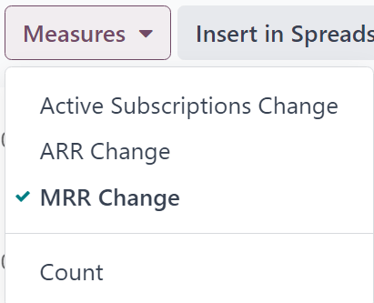
The metric-related options in the Measures drop-down menu on the MRR Breakdown reporting page are:
Active Subscriptions Change
ARR Change
MRR Change
计数
注解
The MRR Change measure option is selected by default.
小技巧
To make a different measure option the default, first, select the desired measure from the Measures drop-down menu. Then, click the (down arrow) icon in the search bar to open the mega menu of filters and groupings.
In the Favorites column, click the (down arrow) icon beside Save current search to reveal a field, where a title can be entered, along with two checkboxes:Default filter and Shared.
Tick the checkbox for Default filter, and click Save.
That newly-chosen measure option is now the default option that appears when this reporting page is accessed.
MRR analysis
To access the MRR Analysis reporting page, navigate to .
By default, the data displayed on the MRR Analysis reporting page is in graph view, with the Line Chart option, Stacked option, and Cumulative option selected.
A default filter is also found in the search bar for Event Date: Month.
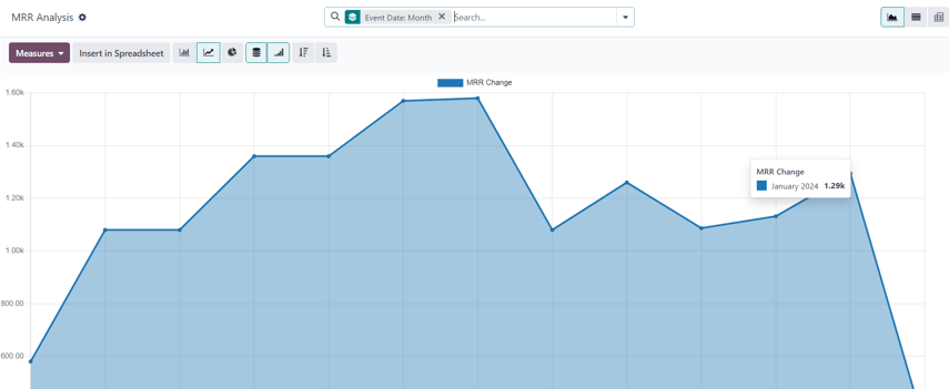
When the Measures drop-down menu on the MRR Analysis reporting page is clicked, a series of metric-related options become available.
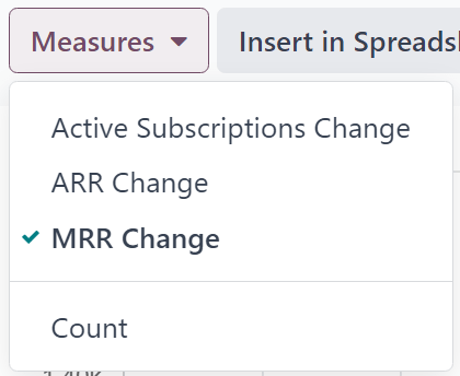
The metric-related options in the Measures drop-down menu on the MRR Analysis reporting page are:
Active Subscriptions Change
ARR Change
MRR Change
计数
注解
The MRR Change measure option is selected by default.